Why the World Needs More Globes
Ever since humans first started making maps of the world, we’ve been getting it wrong: no matter how clever our cartographers, we’ve never found a true way to show the surface of the Earth on a flat sheet of paper. It’s time to tear up the maps and get more globes.

Have you ever tried to flatten the peel of an orange?
We’ve known for a long time that the Earth isn’t flat. For anyone who didn’t get the memo: it’s round. Spherical, to be precise, very slightly bulged at the equator and flattened at the poles, but in pretty good shape for a several-billion-year-old planet.
You know who didn’t get the memo? Mapmakers. In defiance of the astronomers and astronauts who’ll tell anyone who’ll listen that the Earth really is round, cartographers insist on finding ways to make it flat.
If you’ve ever tried to flatten the peel of an orange, you’ll know that it’s impossible. Orange peel doesn’t stretch; instead, it splits. Mapmakers, in their quest to represent the spherical surface of the Earth on a flat sheet of paper, have tried both stretching and splitting. Some projections, with exotic names like the Goode homolosine and the Boggs eumorphic, split the world like an orange peel.


What’s a little distortion between friends?
Other projections take the subtler approach of stretching the continents and oceans in ways they hope you won’t notice. Like all the little lies we tell ourselves, this distortion of the surface of the Earth has consequences.
When the Flemish geographer Gerardus Mercator dreamt up his projection 450 years ago, he was no doubt thinking of how well it would work for nautical navigation. He was surely not thinking of how it stretched the poles relative to the tropics so much that it made Greenland look the same size as Africa.

For the record: Africa is 14 times the size of Greenland. History doesn’t record how Mercator thought he’d get away with such extreme distortion, but get away with it he did. For centuries.
Come the 19th century, when British imperialists were cheerily declaring their queen to be the Empress of India, a quick glance at a world map, according to the Mercator projection, reassured them that India was, after all, only a couple of times the size of the British Isles. It might have come as a shock to learn that the Indian subcontinent is, again, 14 times the size of the British Isles.
In the 20th century, when Americans quaked at a Soviet Union that appeared, by Mercator’s reckoning, to be many times the size of the United States, they might have been a little less prone to fighting proxy wars around the world had they known that the “evil empire” was, in fact, not much more than twice the size, much of it a frozen wasteland.
Does my country look fat in this projection?
More recently, cartographers have tried to correct these disparities between paper appearances and planetary realities. Equal-area projections show the countries and continents the right size, but this equality comes at a cost: distortion. Lambert’s cylindrical equal-area projection shows the world stretched out sideways, short and wide, while Gall’s and Peters’ show the world stretched the other way, tall and narrow.


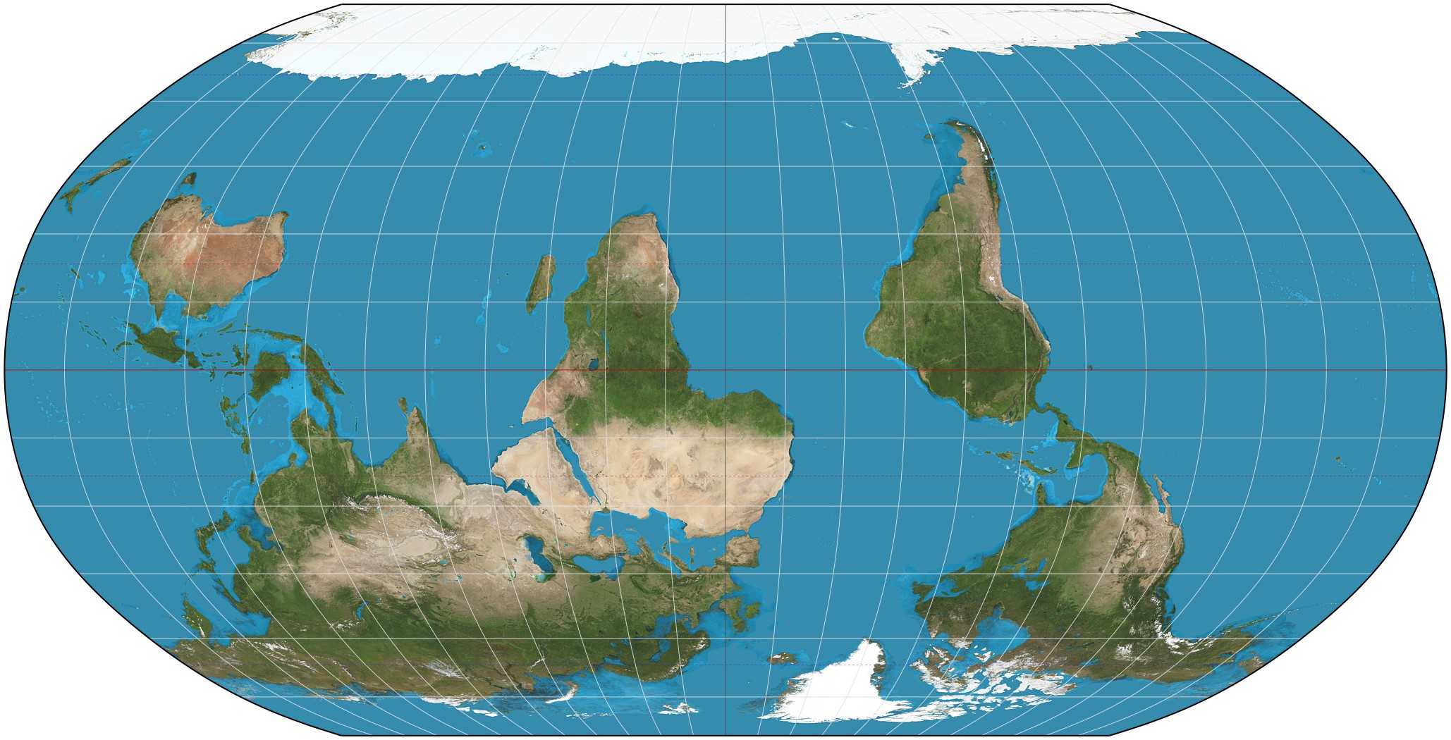
Other projections try to strike a compromise between showing the countries and continents the right size and showing them the right shape. The Robinson projection makes a pretty good go of this.

Still, cartographers can’t help but make biased decisions. Which countries should be shown at the centre of the map? (Africa? America? China? the choice is yours.) Should the equator or the poles be privileged? (We’re so used to the Arctic Ocean being stretched out along the top of the map and Antarctica along the bottom that we forget that both are round.) Which way up is the world? (There’s no reason why Canada should be at the top and Australia at the bottom; just ask an Australian.)

Time to tear up the maps
What to do in the face of these impossibilities?
The answer has been around for over 2,000 years: since the world refuses to be flat, let it be round.
The philosopher Crates of Mallus is credited with the construction of the earliest known globe. Though his placement of the continents was somewhat fanciful, his appreciation of the shape of the Earth was impeccable: his globe was spherical.
The long tradition begun by Crates of Mallus is continued today by globemakers all over the world. Bellerby & Co make exquisite, hand-painted globes in a beautiful studio in London, England. Lander & May, based on the Isle of Wight, offer to customize their hand-made globes to show places and routes their owners have travelled.
Now, Mark Jeffery, who lives on a mountainside in the Canadian Rockies, is taking three-dimensionality to the next level. Not content with making the map spherical, he wants to carve the world out of wood, to show the continents rising from the oceans in tactile relief. He launched the goodwoodglobes crowdfunding campaign on Tuesday, February 5th, to help fund the wood-carving robot he needs to make fully three-dimensional globes a reality.

In a world whose inhabitants are prone to squabbling over which country is on top, we need more globes to remind us that on a spherical planet, every way is up.
